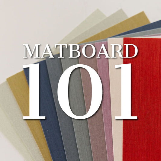
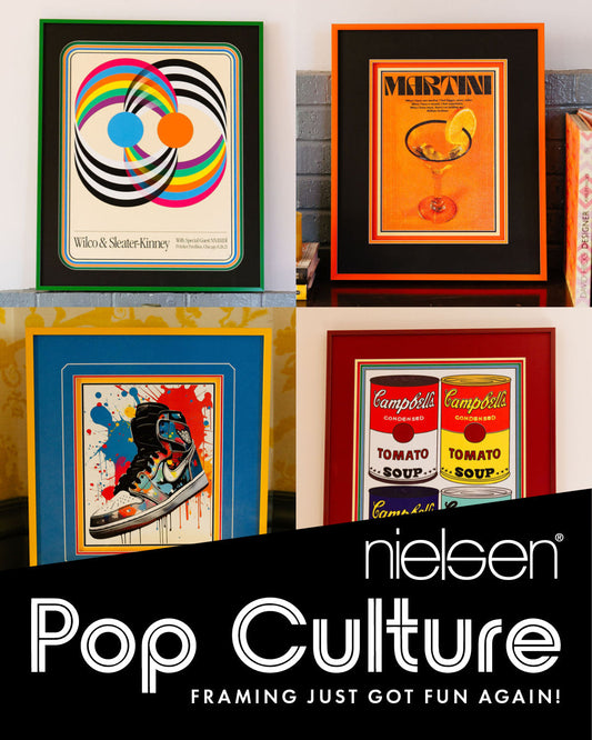
At Crescent, we love color, and staying on top of color trends is one of our favorite priorities.
This month, several companies released their 2020 color forecasts, including Pantone who released their top 12 colors for Spring/Summer 2020. The top 12 include saturated and vibrant colors mixed with soft tones and classic neutrals.
According to Pantone Color Institute color experts, colors for Spring/Summer 2020, New York express our desire for a sense of the familiar. Friendly and relatable, a palette of colors that conveys a sense of ease. At the same time, in this era of personalized self- expression, this palette of recognized favorites uses the familiar to take some unique twists and turns highlighting elements of humor, modernity and entertainment.
“Combining our desire for stability, creativity, and more spontaneous design approaches, the color palette for Spring/Summer 2020 infuses heritage and tradition with a colorful, youthful update that creates strong multi-colored combinations as well as energizing and optimistic pairings,” said Leatrice Eiseman, Executive Director of the Pantone Color Institute.
We are highlighting some of our favorite colors for 2020. We hope the colors provide inspiration for you to consider in your framing designs.
Saffron PANTONE 14-1064
Crescent’s Rag Mat 1663 Chamois Gold
Consider adding the warmth and richness of Chamois Gold to add some Saffron spice to your next project. Chamois Gold adds a vibrant pop of color to a modern composition. Consider pairing it with a crisp white for a tasty combination.

Faded Denim (PANTONE 17-4021)
Crescent’s Rag Mat 1552 Biscay Blue
We love the softness of Biscay Blue, a perfect choice for framing charcoals and watery landscapes. Consider pairing it with crisp whites or soft greys for a peaceful composition.

Coral Pink (PANTONE 14-1318)
Crescent’sRag Mat 1525 Moroccan Spice
Moroccan Spice is one of the hottest color trends we are seeing. Absolutely gorgeous when accented with gold or brass. Use Moroccan Spice to create a sense of drama and adventure.

Chive (PANTONE 19-0323)
Crescent’sRag Mat1554 Williamsburg Green
Williamsburg Green adds a healthy freshness to neutral palettes. It is a green that feels right at home with whites, greys and ochers. Try adding Williamsburg Green when framing botanicals or to add a breath of healthy green with greys, blues and whites.

Ash (PANTONE 16-3802)
Crescent’s Rag Mat1548 Ashen
Ashen continues the trend and love affair with grey but adds a warm and sophisticated twist. Ashen is a luxurious neutral that would work with virtually any color composition. Try combining Ashen with any of our other favorite color picks for exciting new combinations.

Brilliant White (PANTONE 11-4001)
Crescent’sRag Mat1420 Cloud
There is just something wonderful and inviting about a Brilliant White. Crescent’s Cloud captures the freshness of brilliant white. Cloud is the right choice when understated, clean and modern will complete your framing composition.

Grape Compote (PANTONE 18-3513)
Crescent’sRag Mat1640 Purple Wildflower
We are seeing purple and lots of it. For clients who embrace bolder colors, Purple Wildflower makes a statement. Consider pairing Purple Wildflower with gold or brass accents for a composition that is very bold and very on-trend.


